Background
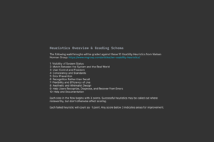
Members of my design team and I were tasked with developing methods for performing Heuristic Evaluation Cognitive Walkthroughs for workflows within the applications we design for. We based these evaluations on Nielsen Norman Group’s 10 Usability Heuristics for User Interface Design,
https://www.nngroup.com/articles/ten-usability-heuristics/
and Evaluate Interface Learnability with Cognitive Walkthroughs,
https://www.nngroup.com/articles/cognitive-walkthroughs/
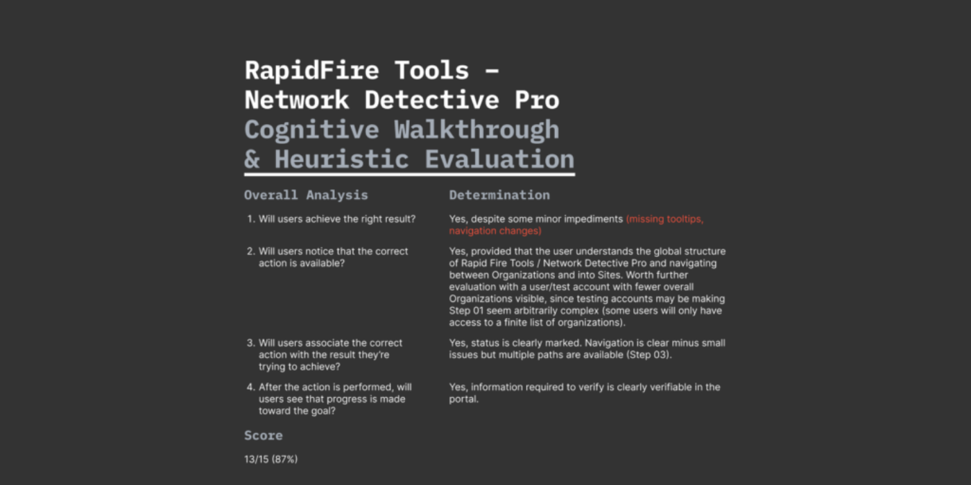
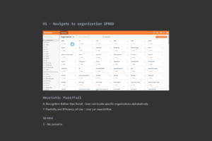
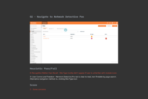
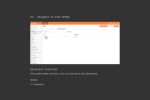
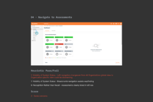
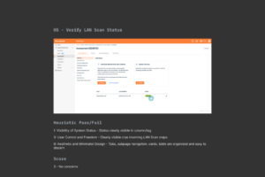
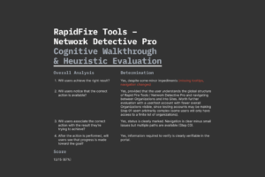
I evaluated two live workflows present in the RapidFire Tools application. Each evaluation was based on the perspective of a persona and problem statement. Starting from there, I determined whether the Usability Heuristics present in each page eased or made difficult achieving the goal of the persona.
Rather than be overly litigious or tedious, I tried to make note of stand out instances or themes when present. If a workflow had a breadcrumb present on each page it didn’t seem necessary to note “1: Visibility of System Status” in the positive column over and over again. Similarly for issues present, if an issue was present multiple times it could be sufficient to note the appearance as a theme and summarize. I ended each evaluation with a Cognitive Walkthrough summary based on the noted Heuristic strengths and weaknesses, and a percentage score.
This approach is to many degrees subjective, but anyone doing similar evaluations could adjust their approach to suit other needs and goals. My goals were to familiarize myself with this method of evaluation, and better understand Usability Heuristics as outlined by NN/g as an overall lens for evaluating user experience hurdles in an application workflow.
Scalability via Scoring
As part of the Heuristic Evaluation I included a scoring rubric. This would be useful if we were ever to scale up or broaden the evaluation effort. Scoring application workflows allows you to assess at a glance the overall strength of a workflow based on common usability heuristics. Workflows of varying depth or complexity can be commonly scored using a simple equation:
( Total points / Total awarded points ) x 100 = Heuristic Evaluation Score %
In the evaluation I awarded 3 points per page and then deducted 1 point per Heuristic area of concern. If no issues were present, a page would keep all three points. This would also be simple to scale if you found during the course of your evaluation that certain steps had many deductions (ex: more than 3). You can adjust the total point award pages begin with to accommodate your lowest score and still end up with a meaningful percentage score.
For example, a sample evaluation of a workflow spanning five pages awarded 15 points total, where two pages each had 1 point deducted, the scoring worked out to be:
( 13 Total points / 15 Total awarded points ) x 100 = 87%
You could further nuance your scoring rubric based on other considerations, like would you weigh one Heuristic area more or less than another? It gets to be a bit of a rules-system design excercise but it was interesting how the scoring system seemed flexible and balanceable in a sense that allows a quick view of things. “This workflow seems to have more issues than these, let’s dive deeper as to why” sorts of scenarios.
