Problem Statement
In the previous version of the Datto customer portal, all device and subscription upgrades required action from an account manager. Requiring an account manager to perform every upgrade/refresh action presented issues for scalability. Also due to idiosyncracies in the upgrade process, there have been errors in correctly coding an upgrade or renewal action as a revenue gain or loss.
Solution
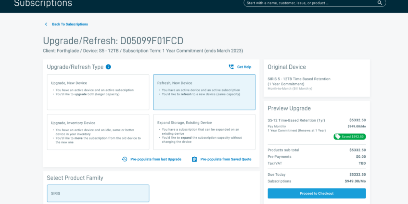
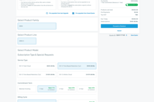
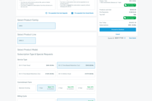
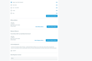
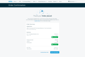
We designed a new upgrade/refresh flow that a user can self initiate from Subscription Management. Users still have the ability to escalate an upgrade to their account manager throughout the process. The goal was to allow roughly 90% of upgrades become self serve motions, freeing up account managers to focus on more complex issues when needed. We included options for multiple upgrade paths so that eact transaction would be correctly coded and eliminate the errors in tracking metrics. The upgrade flow was designed to resemble the existing store purchasing and checkout experience since users would already be familiar with those patterns.
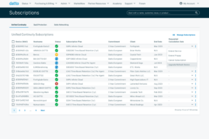
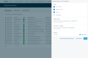
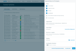
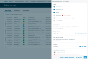
Additional status tracking would be needed for upgrades requiring user action post transaction (primarily with device returns/refreshes). We added appropriate statuses to Subscription Management to help users track the status of an upgrade, and proposed a new menu tray showing the current status of an upgrade and the ability to retrieve useful information, like shipping labels and tracking.
Testing and Refinement: Asking vs. Telling
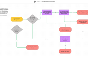
Part of the original issue we were attempting to solve was the incorrect coding of updgrade/refresh types. In the new proposed design, users would be limited to opt into a few specific options, but there would still be opportunity for a user to choose the wrong option. Part of the initial solution proposed by our team was to involve a questionaire as part of the process. I created this flow diagram to begin scoping that component.
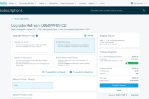
Much of the Datto store experience is based on sort of a questionnaire/form flow, so this could have been a sensible extension of that mindset. However, as we continued working through the topic the concept of the questionnaire seemed like a heavy way to begin a self serve process, and that could discourage users from using it (the opposite of what we were hoping for with something to reduce overall effort). In the end we opted for informative tile buttons at the beginning of the form that would explain to the user what each upgrade or refresh type entails.
This is visible above in the “Upgrade/Refresh Type” section at the top of the page. Each button describes the use case for the action type listed, and based on the first selection, the rest of the form would refill with the appropriate contents.
Additionally, any upgrade/refresh request would eventually pass the desk of the appropriate account manager. The account manager would be able to review and respond to any request that may seem mistyped or unreasonable.
There was some future state discussion around potential to minify some components of the form. Mostly something that we would consider in the future once the form has had more time to socialize with customers, we could move some of the information out of the buttons and into an faq or other section if it seemed that users understood the expectations and typing better without visible prompts.
