Problem Statement
The Shudder website is singularly focused on one goal: driving subscriptions to their streaming service. In my hypothetical exercise, Shudder wanted to increase visibility on the unique content they offer. Also they wanted to facilitate deeper engagement within their community of users.
Solution
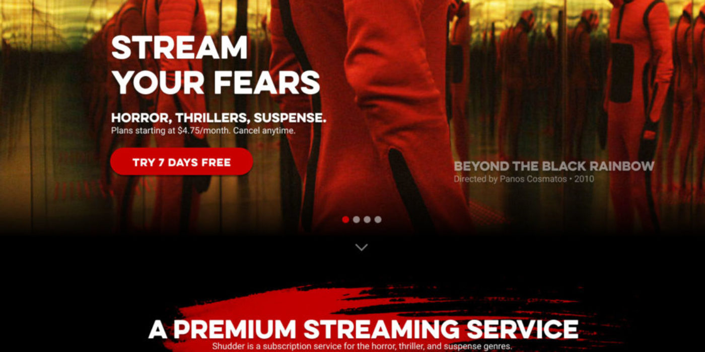
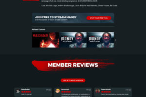
Shudder is a horror centric streaming service by AMC Networks. It features “horror, suspense, thrillers, uncut and ad-free, with every title handpicked by genre experts,” and community based member written reviews. Horror tends to be very lurid, vibrant, and visceral. I sought to make the landing page more visually magnetic by featuring more full width images from their film catalog. A few other areas I sought to improve were:
- Adding subtle attribution text to film images on the landing page to aid in discovery of some of the gems in their catalog.
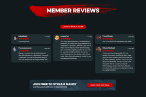
- Adding the red paint slash elements to aid in more visual separation while browsing and adding an extra visceral element to the design system.
- Making more use of the primary header typeface on subheadings throughout the pages, better type unity.
- Emphasize the community features on the selected film pages by giving usernames and avatars more prominence.
There is room for further exploration and testing here to see what could further be done to improve things. For instance, does adding more focus to discovery and community features dilute the strength of the primary CTA “Try 7 days free”? It’s possible. More food for thought.
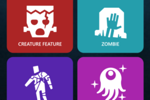
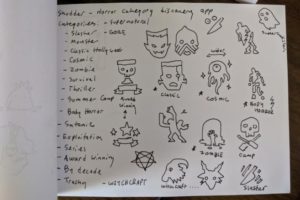
I also began an icon set that could be used in a mobile friendly discovery app or microsite. I wanted the icons to be resonant of old-school library spine genre icons. You can see some of the sketches I made to start things off before creating them as vector art.
I used Photoshop and Figma to create these layouts and Figma to create the icons.
