Background
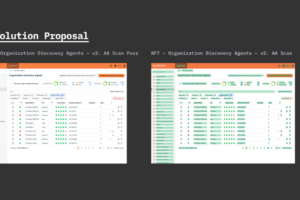
Members of my design team and I were tasked with performing accessibility evaluations for our applications. Primarily we wanted to be prepared to make recommendations and document known issues in advance of future improved accessibility standards being rolled out organization-wide. I used a Figma plugin called Contrast,
https://www.figma.com/community/plugin/911262488575486588/contrast
to perform an AA accessibility scan on a sample page that featured a varied amount of design system components.
Overall Method
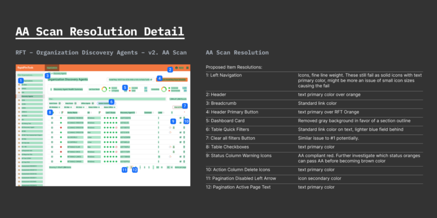
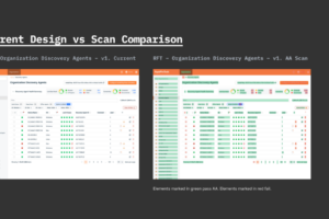
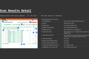
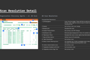
For a document like this, I wanted to be able to present a detailed list of the components at risk of failing AA contrast. Every component that failed the scan was assigned a number so I could provide notes on why I believed it to be failing AA. I also created a version of the page with every component adjusted to the point that it could pass AA, barring some exceptions:
- Icons in the left nav persistently failed even if they were fully black (#000000), and black is darker than our icon primary color. Further, these icons still failed if they were set to filled. My guess is that the icons were failing persistently because of their small size. Larger icons with similar color settings did pass AA.
- Also the icon in the secondary outline button above the table failed even when set to black. I believe this is a similar issue to the navigation icons.
Proposed remedies to the contrast issues were also noted in an itemized format.
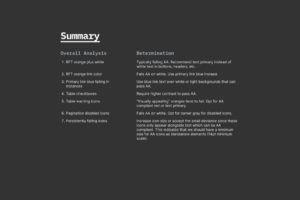
I provided a summary of all of the findings on the final slide. It was interesting to discover what common design system components passed AA and what failed. There were also issues with many components that used the primary application/brand color, but most of those instances could be improved by darkening the text color over the brand orange.
Robust AA contrast at the design system level has not yet been internally promoted within the organization, but being able to evaluate existing components and identify specific areas to improve upon will help in any future efforts towards better compliance with accessibility standards.
