Problem Statement
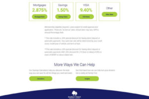
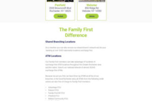
Family First is a credit union in Rochester, NY. They needed an update to their existing website to help current members and potential members find the information they need more easily. Specifically there were certain content areas, like interest rates and branch locations, which we were asked to bring additional visibility to.
Solution
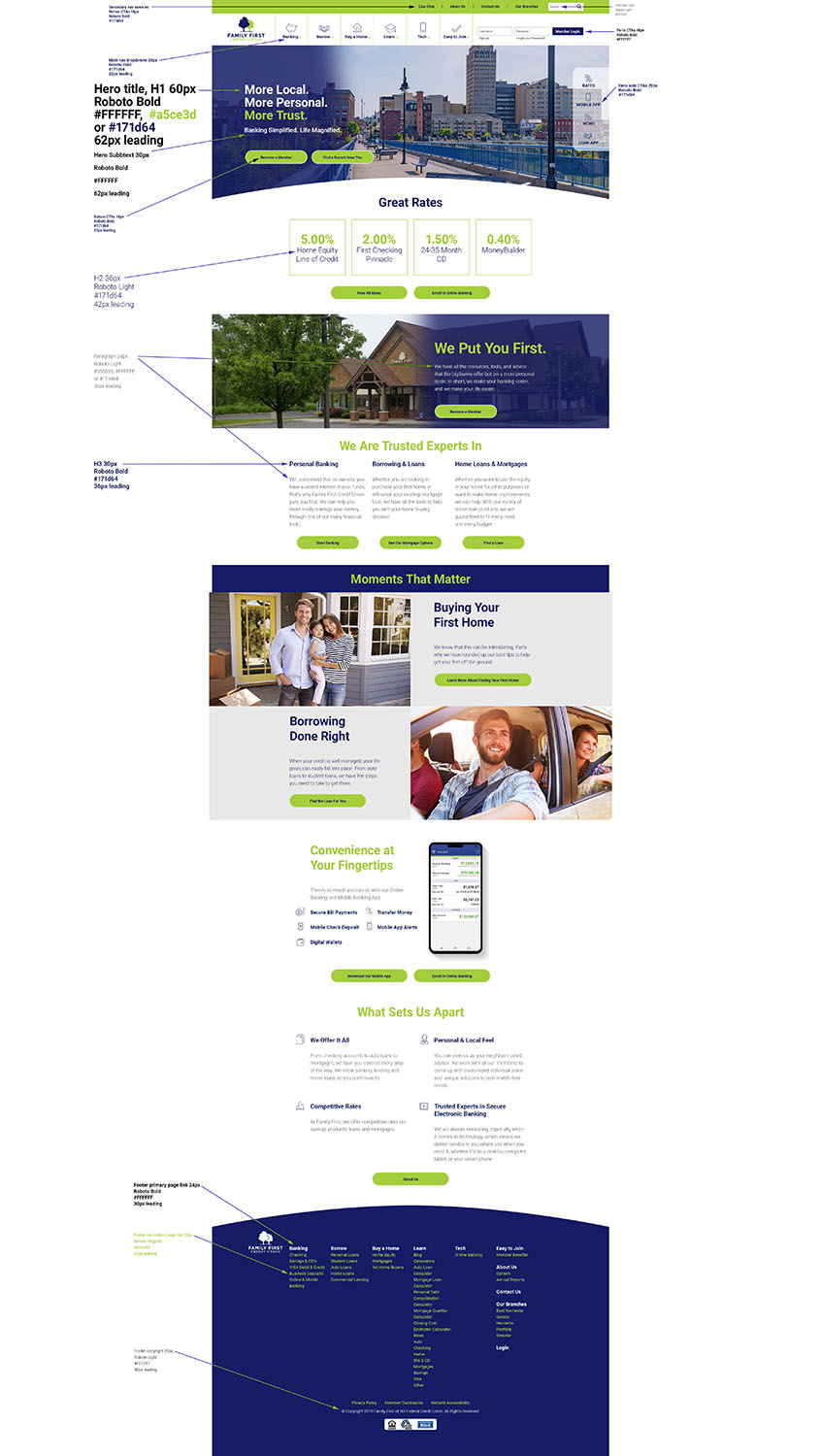
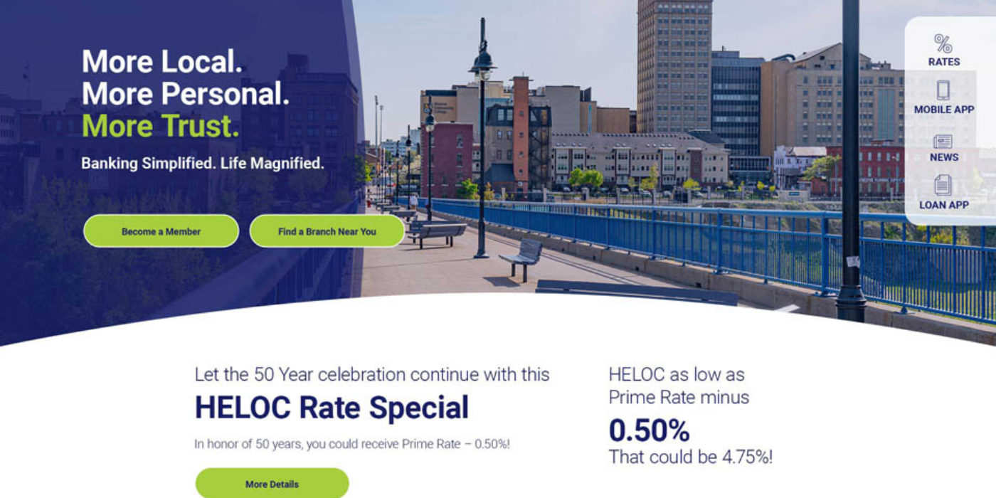
Our overall solution for Family First involved more open space, bold color and photo use to draw the eye, and intentionally trying to keep content density legible for the user. We gave featured interest rates and branches large call outs and call to actions to help users understand them better at a glance.
I was responsible for the majority of the design work, and handled client presentations of creative work, and feedback documentation.
I collaborated with another designer during the project kickoff and worked closely with our copywriter at the outset through midway through our timeline. Primarily we were working on finding a marriage between copy and layouts while trying to keep things modular and simpler to execute for the developers.
Additionally, I worked extensively with the development team to help ease their pipeline. Beyond handoff, we spent a good deal of time discussing specifics of layouts, edge cases, optimization strategies, and how to best translate the content we designed into templates. I also maintained a style guide with sample css styling for our main site styles and colors.
