Problem Statement
Eagledream needed to update the way we presented our website content. We were recognizing issues in presenting our array of services to new and existing customers in ways that they could easily understand our offerings.
Often our website would function as a support tool or follow up to a sales call, so giving the sales team clear elements that could help establish the baseline for a conversation or future relationship was also important.
Solution
Beginning with some initial wireframes provided by another designer, I created new wireframes and provided finished designs based on the initial concepts.
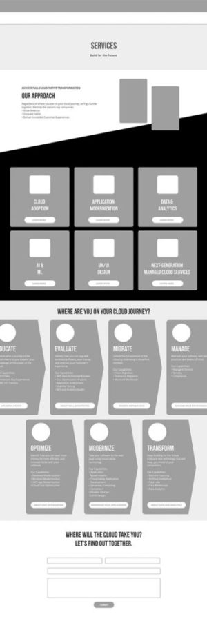
We spent considerable effort on our Services page update. It was a challenge because we have a spectrum of services we offer, but often visiting users are looking for one specific service and saying “Do they do what I’m looking for?” We felt breaking elements out into smaller buckets and keeping the information digestible for each service helped yield a better visitor experience.
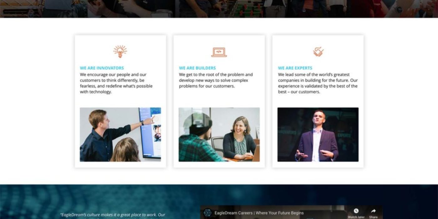
We also updated other pages to bring them into line with the new design logic. Our Careers page was another that we simplified to give visitors a clearer path to individual position openings, while also updating the above the fold content to give a better view of our culture.
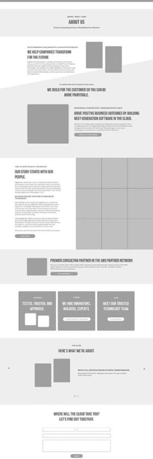
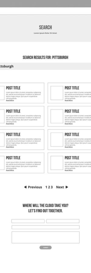
Below are some of the wireframes I worked on for various pages.
